
-
 Identity design
A symbol is the most reductive depiction of a corporate entity. It reflects the corporate character and philosophy. Longevity, memorability, reliability are some of the vital elements of identity design. Every time the audience is exposed to the visual identity, the client gets a recurring benefit.
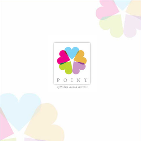 Point
Point
‘point’ is an organization that is into curriculum-based films for school students. Their films make even an average student interested in subjects that appear boring in textbooks. The student’s heart now engages in education. His personality flowers and he becomes a star student. 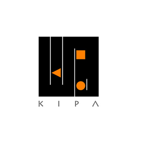 kipa
kipa
pure geometrical forms are important to architecture. The triangle forms a ‘k’, the square and the circle form ‘p’ and ‘a’ respectively. The identity is for ‘kipa’ architects.
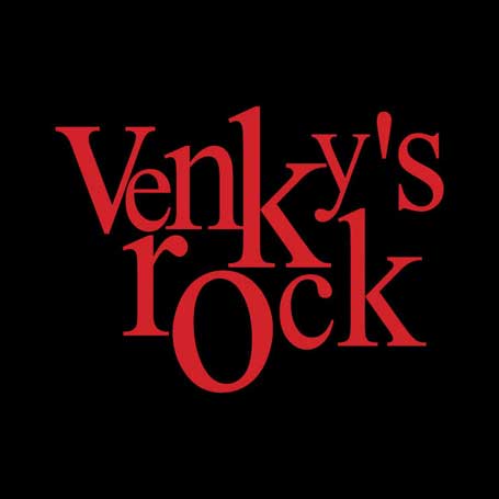 Venky’s Rock
Typography simulates the rhythm of music for a company that is into entertainment – like film production, music publishing and the branding and marketing of wine.
 Stamp & registration department
The Government’s Stamp & Registration Dept. sought professional identity. In Devanagari script, their name has ‘Na’ and ‘Ma’ as main alphabets. They have been integrated to form a swastika (a symbol of man in the Indian culture). Its outward hexagonal form is akin to the noble leader Shivaji’s seal. The identity stands for ‘trust’ and ‘service towards mankind.’
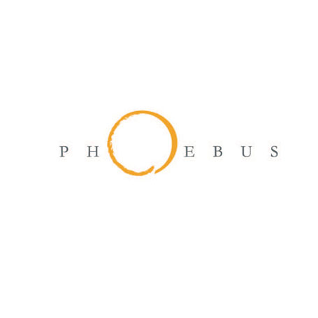 phoebus
a leading animation studio uses the name of a greek sun god. Their pronunciation is ‘phebus’ but people used to say ‘phobus’. In this identity, an abstraction of a sun replaces the ‘O’. The ‘O’ in this logo has a textured brush stroke that gradually transforms into a fine stroke. This depicts the translation of rough ideas into concepts and finished drawings. Also, this logo design has helped people pronounce the name correctly
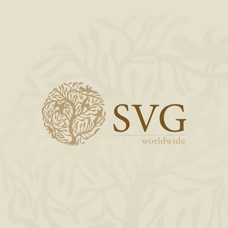 SVG
SVG
An Identity for a business entity that is into diverse businesses from jewellery, restaurants, hotels, real estate, animation, software and education. All their business verticals enrich life. The ‘tree of life’ identity reflects their values and culture. 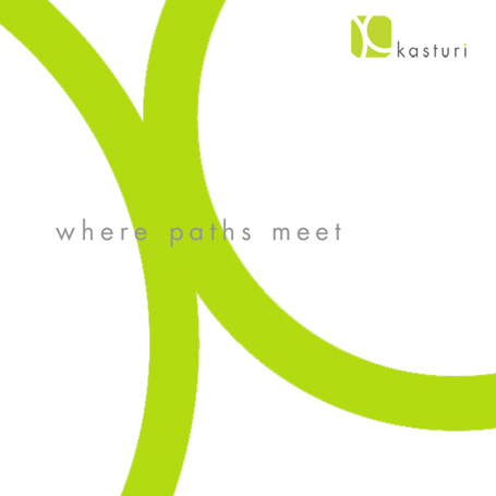 Kasturi
A building and construction group, kasturi is known for quality projects. Their business deals with providing spaces for living, working and entertainment. We defined their brand as ‘kasturi- where paths meet’ in keeping with the diverse range of people whose lives they touch on a daily basis. Parts of two circles meet at a point to connote this meaning while forming a graphic ‘k’.
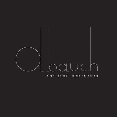 debauch
a firm that exports fashion accessories to paris needed an equally stylish identity. We sought a humorous name to counter politically correct attitudes. ‘debauch – high living. high thinking’ was our answer.
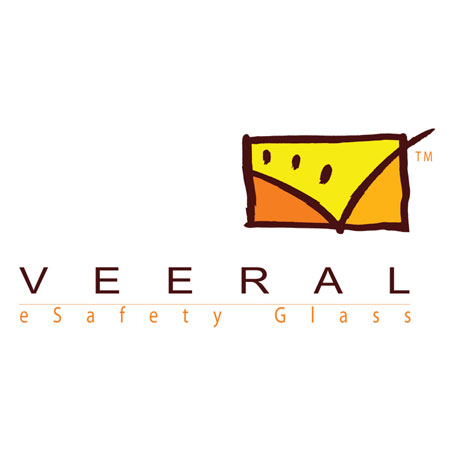 veeral
an architectural glass manufacturing company meant an association with a window. A ‘V’ seen through the window shows a bright present and future.
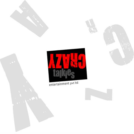 Crazy talkies
A movie rental service that offers quality dvd’s for home viewing. The service is so affordable, it will turn you into a movie buff. The identity inverts the word crazy in keeping with the spirit of the name. the color scheme is derived from the ‘exit’ signs of cinema halls.